Why Epic Sunsets Are Bad for Landscape Photography
When I first started focusing on landscapes (I shifted from travel photography) I was always chasing the light and seeking that epic sunrise or sunset. If I didn’t get a fantastic color burn, I said to myself, I’ll come back and keep coming back until I get it. I thought if I had a great foreground adding an epic sky would make the image even better (literally my logic was it had to be double plus good). Informally, from talking with other landscape photographers I think this is pretty normal view, we are always looking at weather apps trying to see if the sky is going to be good enough to go out and shoot.
I did this for several years and I slowly realized that while these types of photos can get a lot of likes on social media, ultimately it was holding me back and hindering me from making better images. Now I know “better” when it comes to art and photography is a bit of a nebulous term. What makes a photo good is subjective, so I’ll try to be as clear and specific as possible.
First, an epic sky doesn’t compensate for weak foreground. If I spend all my energy on getting a great sky I’m not spending it on improving the foreground. Often the direction of the best color burn is not the same as the direction of the best composition. So you have a choice, and if you decide to point your camera toward the best sky color you may end up with a lackluster foreground.
Second, an epic sky can overpower the main subject and take attention away from it. If your main subject is something subtle it will be visually overwhelmed by either the color, contrast, or saturation that comes with a color burn.
Third, an epic sky tends to leave a strong color cast over the foreground which can be difficult to neutralize. Although having a single dominant color can work in some scenes, often it just takes away from the color diversity in your image.
Fourth, from a portfolio view all my pictures started looking the same with a color palette that had a heavy emphasis on the reds, pinks, and magentas you get from the skies with an epic color burn. Frankly, I was surprised at how similar everything looked when looking at a page of thumbnails.
Finally, if you sell photographs, it’s good to have a wide variety of colors in your images. I’ve actually had clients come up and ask for different versions of a picture that was not so pink to better match the room decor. Sunset colors are very strong emotionally and while they may make a viewer’s jaw drop due to the incredible scene, sometimes people want a more calming or relaxing experience.
Here are a few examples of photos I’ve taken to illustrate the above points:
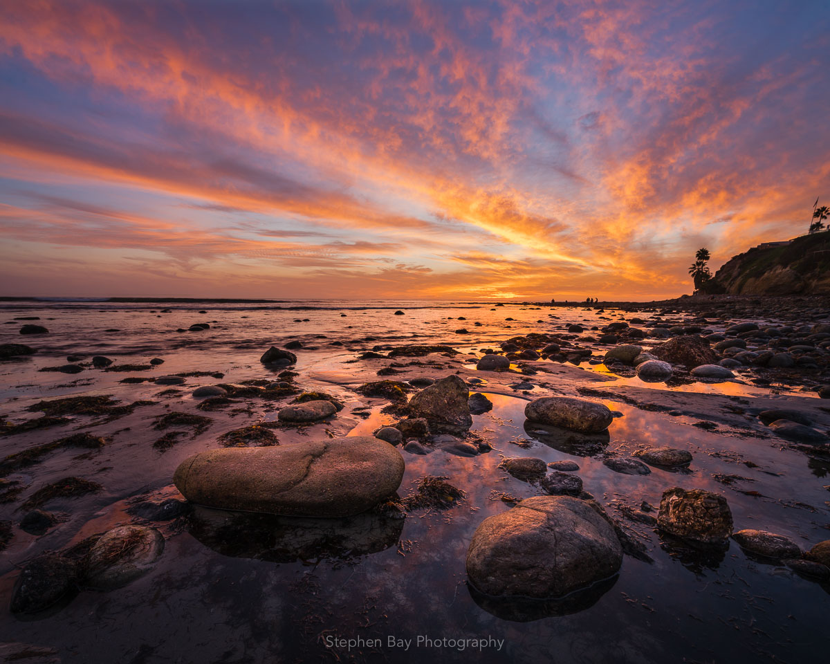 In this example I think the sunset doesn’t compensate for the weak foreground. I should have spent more time trying to find a better composition than on capturing the colors in the sky. The layout of the rocks is just too messy and lacks strong leading lines.
 This was one of the most stunning sunsets I’ve seen and photographed. After the sun went beneath the horizon, these low lying clouds just above my position literally exploded in this incredible color. While I’m glad to have experienced this, the sky just completely overpowers my subject which are the palm trees and calm water instead of complementing it.

Here’s an example where I think an epic sky is appropriate and complements the foreground nicely. This was the strongest sunset in 2018 (San Diego) and the color burn went on for a very long time. In this case, the foreground is visually very loud and doesn’t get drowned out by the sky. I’ve also chosen to keep the sky small in the frame to help keep the emphasis on the foreground.